Honouring the past while reimagining the future for a legacy brand.
IWI is a thirty-year-old company that specialises in making pens, pen tips and stationery items for leading global brands such as BIC. They are well-known and highly respected in the space.
IWI came to us because they were branching out into the non-writing instruments business by leveraging their manufacturing prowess. They wanted to retain the heritage of their brand but were struggling to showcase their latest offerings as their name confused prospective customers and pigeon-holed them into the writing instruments industry.
With interviews we discovered that over the years, as the brand’s offerings and customers had grown and diversified, so had their personality and capabilities. We encouraged them to take a step back to rethink their brand strategy.
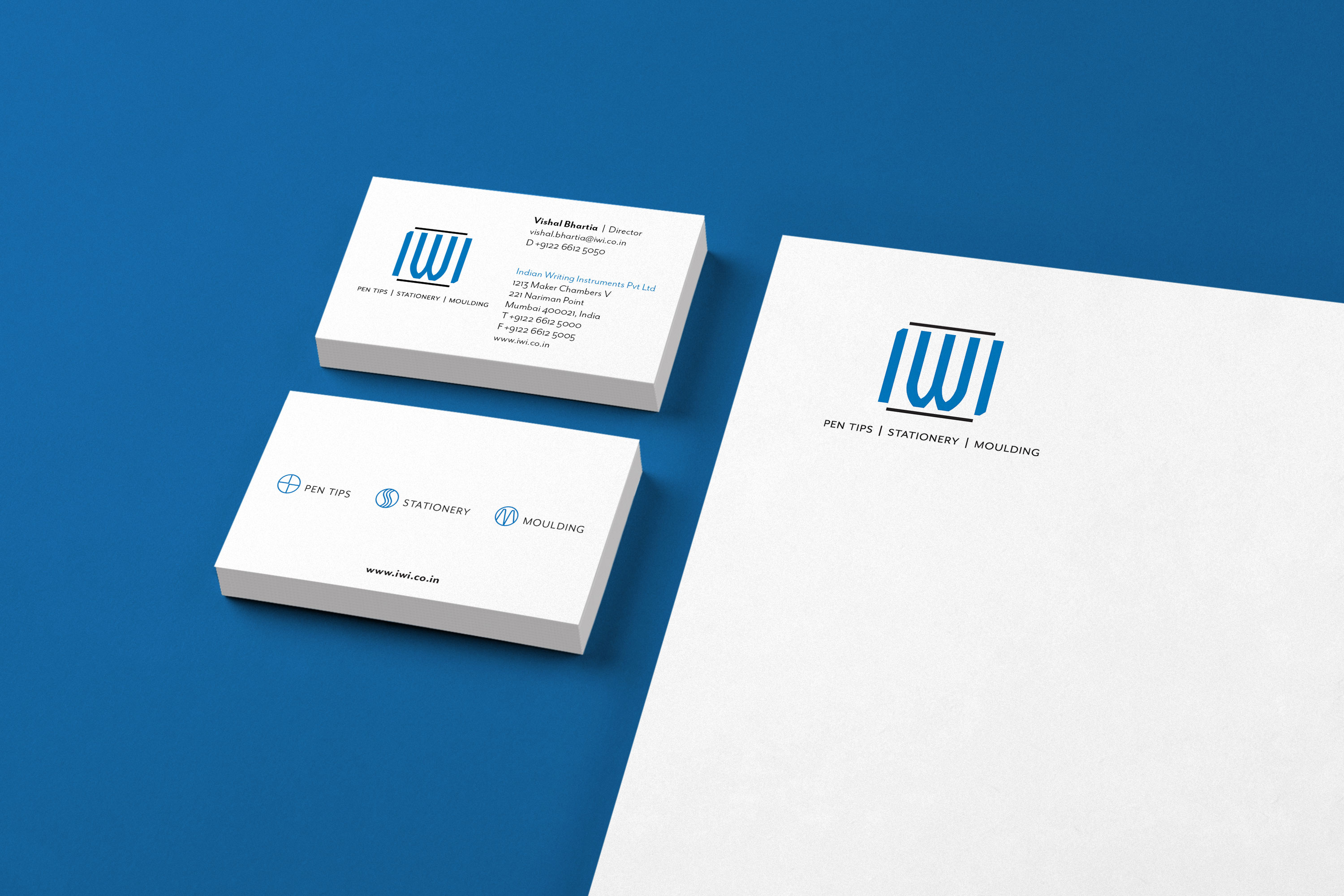
Our customer research revealed that the firm was commonly referred to as IWI in the global market. We suggested capitalising on this habit to retire the name “Indian Writing Instruments” and going simply with the acronym IWI. Then we reimagined everything these three letters could mean for this legacy brand with a forward-looking outlook.
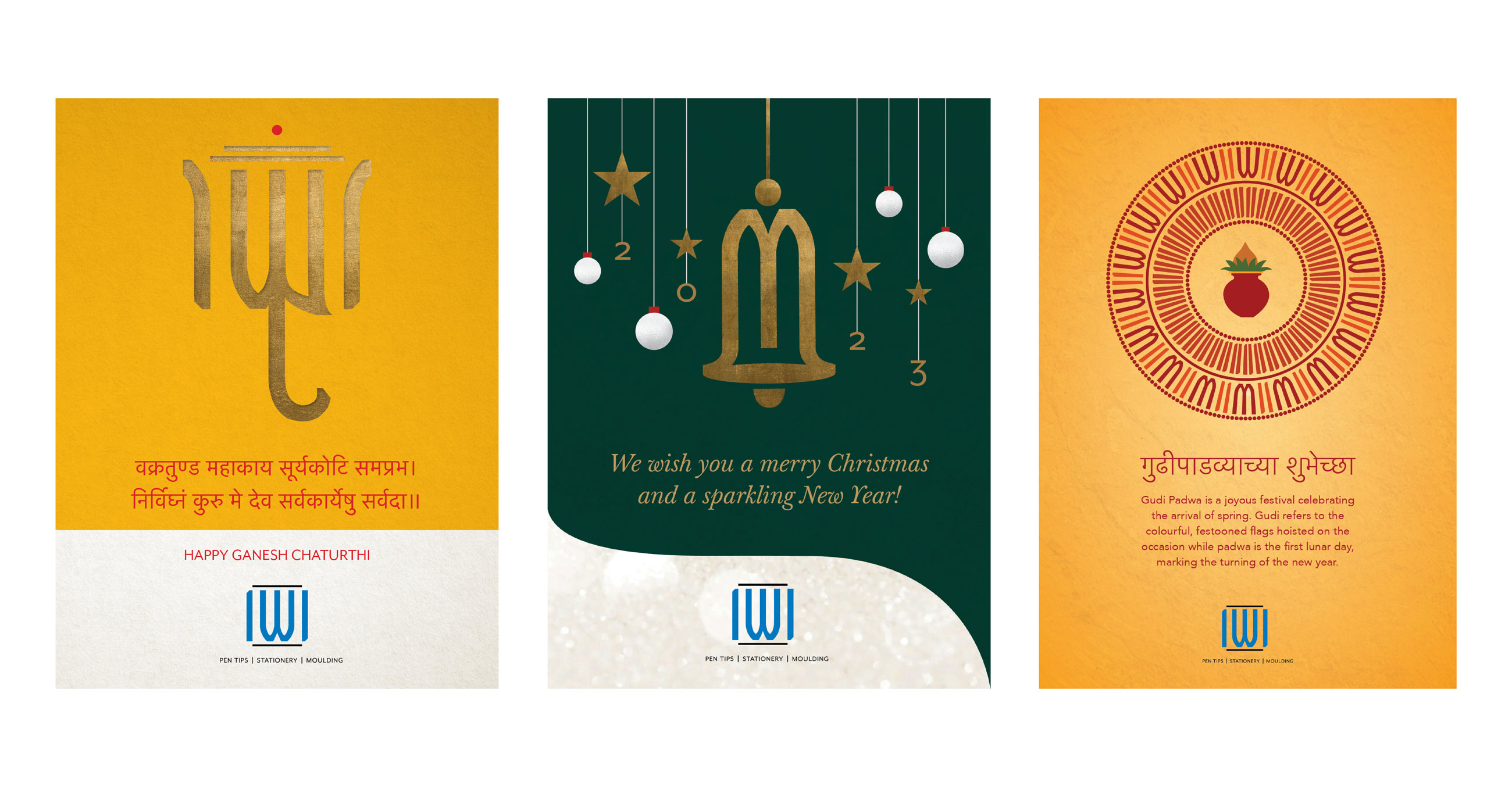
The refreshed identity highlights the company’s high-quality, high-precision offerings while positioning it for the future. The new logo is clean and modern with bold typography along with a clean, modern nomenclature system and visual language. The logo animation was created by Angelo David.
“Precise, detailed and good value! An interesting process involving lots of details and discussions to arrive at such a simple logo that remembers our legacy and highlights our future.”
Vishal Bhartia Director, Indian Writing Instruments Pvt. Ltd.